
Flutter widgets are the foundation of Flutter app development. As a declarative framework, Flutter has emerged as one of the most popular tools for cross-platform mobile app development. Its widget-based architecture allows developers to build beautiful, responsive user interfaces with a single codebase that runs on both iOS and Android. For newcomers to Flutter, understanding the core Flutter widgets is essential to becoming proficient with the framework.
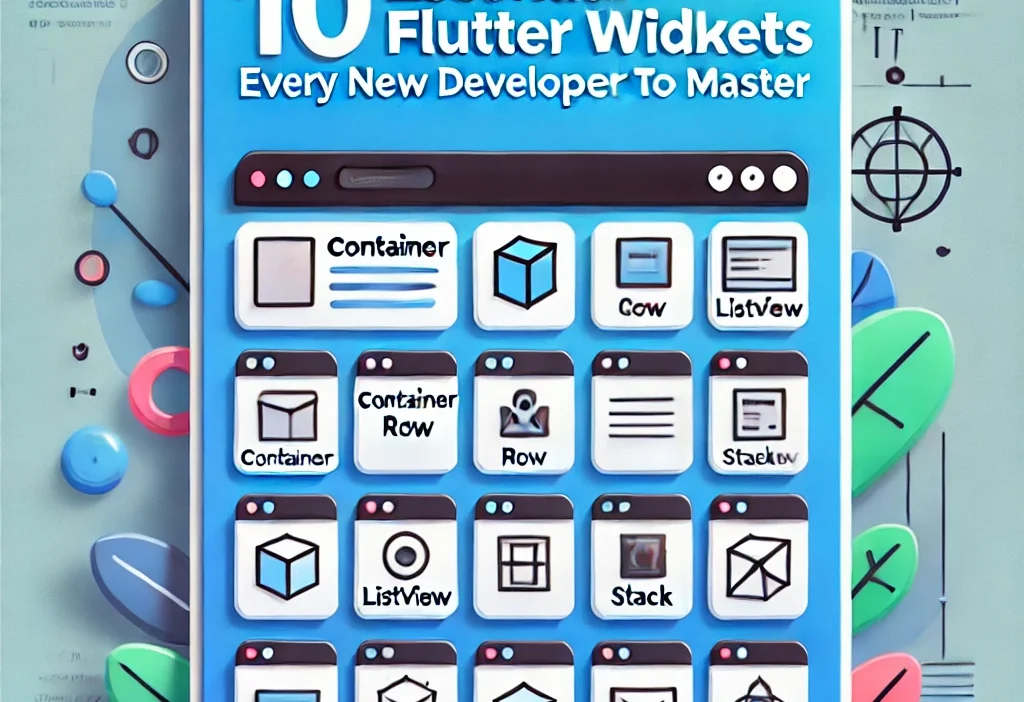
In this comprehensive guide, we’ll explore the 10 most essential Flutter widgets that every new developer should master. Each Flutter widget serves as a fundamental building block for creating modern, interactive mobile applications.
1. Container Widget
The Container widget is perhaps the most versatile and commonly used Flutter widget. Think of it as the Swiss Army knife of Flutter widgets – it allows you to create rectangular visual elements with a wide range of customization options.
Key Features of the Container Widget
- Styling: Apply custom colors, gradients, borders, and shadows
- Positioning: Control alignment and padding
- Sizing: Define specific or constrained dimensions
- Child Management: Hold and position a single child widget
When to Use the Container Widget
Use Container when you need to:
- Add padding, margins, or borders around a widget
- Apply visual decorations like colors or shadows
- Constrain a widget’s dimensions
- Position a widget using alignment
Code Example of the Container Widget
Container(
  margin: EdgeInsets.all(10.0),
  padding: EdgeInsets.all(15.0),
  width: 200.0,
  height: 100.0,
  alignment: Alignment.center,
  decoration: BoxDecoration(
    color: Colors.blue,
    borderRadius: BorderRadius.circular(10.0),
    boxShadow: [
      BoxShadow(
        color: Colors.grey.withOpacity(0.5),
        spreadRadius: 2,
        blurRadius: 5,
        offset: Offset(0, 3),
      ),
    ],
  ),
  child: Text(
    'Hello Flutter!',
    style: TextStyle(
      color: Colors.white,
      fontSize: 18.0,
    ),
  ),
)
Best Practices for Container Widgets
- Avoid unnecessary nesting of Containers – combine properties in a single Container when possible
- Use Container for visual styling, not for structural layout (use Row, Column, or Stack instead)
- When you only need padding, consider using the simpler Padding widget
2. Row and Column Widgets
Row and Column are fundamental Flutter widgets for layout that arrange their children in horizontal and vertical sequences, respectively. These Flutter widgets form the backbone of most Flutter layouts.
Key Features of Row and Column Widgets
- Direction: Row arranges widgets horizontally, Column arranges widgets vertically
- Alignment: Control how children are positioned along the main and cross axes
- Spacing: Distribute available space between children
- Sizing: Adapt to available space or to their children’s needs
When to Use Row and Column Widgets
Use Row and Column Flutter widgets when you need to:
- Arrange multiple widgets in a line (horizontal or vertical)
- Create basic layouts like forms, lists, or toolbars
- Implement responsive designs that adapt to different screen sizes
Code Example of Row and Column Widgets
Column(
  mainAxisAlignment: MainAxisAlignment.spaceEvenly,
  crossAxisAlignment: CrossAxisAlignment.stretch,
  children: [
    Text('Header', style: TextStyle(fontSize: 24, fontWeight: FontWeight.bold)),
    SizedBox(height: 10),
    Row(
      mainAxisAlignment: MainAxisAlignment.spaceBetween,
      children: [
        Icon(Icons.star, color: Colors.amber),
        Text('4.9 (128 reviews)'),
        Chip(label: Text('Featured')),
      ],
    ),
    SizedBox(height: 10),
    Text('Lorem ipsum dolor sit amet, consectetur adipiscing elit...'),
    ElevatedButton(
      child: Text('Learn More'),
      onPressed: () {},
    ),
  ],
)
Best Practices for Row and Column Widgets
- Remember that Row and Column Flutter widgets will take up all available space in their direction by default
- Use
mainAxisSize: MainAxisSize.minto make them shrink to fit their children - Be cautious with using unbounded Rows inside scrollable areas (use Expanded or flexible width children)
- Add SizedBox widgets between children for spacing rather than using padding on each child
3. ListView Widget
ListView is a scrollable list Flutter widget that displays its children one after another. It’s one of the most commonly used Flutter widgets for displaying collections of data in a mobile app.
Key Features of the ListView Widget
- Scrollability: Automatically handles scrolling behavior
- Builders: Efficiently renders only visible items using ListView.builder
- Separators: Adds dividers between items with ListView.separated
- Scroll Control: Supports custom scroll controllers for advanced behaviors
When to Use the ListView Widget
Use ListView when you need to:
- Display a list of items that might exceed the screen height
- Efficiently render large lists of data
- Create scrollable content with items of uniform or varying heights
Code Example of the ListView Widget
// Basic ListView widget
ListView(
  children: [
    ListTile(
      leading: Icon(Icons.map),
      title: Text('Map'),
      subtitle: Text('View location on map'),
      trailing: Icon(Icons.arrow_forward_ios),
      onTap: () {},
    ),
    ListTile(
      leading: Icon(Icons.photo_album),
      title: Text('Album'),
      subtitle: Text('View photo album'),
      trailing: Icon(Icons.arrow_forward_ios),
      onTap: () {},
    ),
    // More list items...
  ],
)

// Efficient ListView.builder for large lists
ListView.builder(
  itemCount: items.length,
  itemBuilder: (context, index) {
    return ListTile(
      title: Text(items[index].title),
      subtitle: Text(items[index].description),
      onTap: () => selectItem(items[index]),
    );
  },
)
Best Practices for ListView Widgets
- Use ListView.builder for lists with many items or unknown length
- Remember that ListView takes infinite height in a Column, so wrap it with Expanded or give it a fixed height
- Consider using ListView.separated when you need consistent separators between items
- For complex lists with different item types, implement conditional logic in the itemBuilder
4. Stack Widget
Stack is a powerful Flutter widget that allows you to overlay widgets on top of each other. Unlike Row and Column which arrange widgets sequentially, Stack positions its children relative to its edges or to each other.
Key Features of the Stack Widget
- Layering: Place widgets on top of one another
- Positioning: Control exact placement with Positioned widget
- Alignment: Define default alignment for non-positioned children
- Overflow: Handle children that extend beyond the stack’s bounds
When to Use the Stack Widget
Use Stack Flutter widget when you need to:
- Overlay text or controls on top of images or videos
- Create complex UI elements with overlapping components
- Position elements at specific coordinates relative to a container
- Implement custom UI designs that can’t be achieved with standard layouts
Code Example of the Stack Widget
Stack(
  alignment: Alignment.center,
  children: [
    // Bottom layer - background image
    Image.asset(
      'assets/background.jpg',
      width: double.infinity,
      height: 200,
      fit: BoxFit.cover,
    ),

    // Middle layer - gradient overlay
    Container(
      width: double.infinity,
      height: 200,
      decoration: BoxDecoration(
        gradient: LinearGradient(
          begin: Alignment.topCenter,
          end: Alignment.bottomCenter,
          colors: [Colors.transparent, Colors.black.withOpacity(0.7)],
        ),
      ),
    ),

    // Top layer - positioned text
    Positioned(
      bottom: 20,
      left: 20,
      child: Column(
        crossAxisAlignment: CrossAxisAlignment.start,
        children: [
          Text(
            'Discover Nature',
            style: TextStyle(
              color: Colors.white,
              fontSize: 24,
              fontWeight: FontWeight.bold,
            ),
          ),
          Text(
            'Explore the wilderness',
            style: TextStyle(color: Colors.white70),
          ),
        ],
      ),
    ),
  ],
)
Best Practices for Stack Widgets
- Use the Positioned widget to precisely control the position of children
- Remember that non-positioned children will be sized and positioned according to the stack’s alignment property
- Consider using Material design principles before creating custom overlapping UI elements
- Be aware of accessibility challenges that can arise from complex stacked interfaces
5. TextField Widget
TextField is the primary Flutter widget for accepting user input. It provides a customizable text input field with various features like validation, decoration, and input formatting.
Key Features of the TextField Widget
- Input Types: Configure for different input types (text, number, email, password)
- Decoration: Add labels, hints, icons, and error messages
- Validation: Implement custom validation logic
- Controllers: Manage and listen to text changes with TextEditingController
When to Use the TextField Widget
Use TextField Flutter widget when you need to:
- Collect user input in forms
- Implement search functionality
- Create editable text areas
- Build login/registration screens
Code Example of the TextField Widget
// Create a controller to manage the text input
final TextEditingController _emailController = TextEditingController();

// Create the TextField with decoration and validation
TextField(
  controller: _emailController,
  keyboardType: TextInputType.emailAddress,
  decoration: InputDecoration(
    labelText: 'Email Address',
    hintText: 'ex*****@****in.com',
    prefixIcon: Icon(Icons.email),
    border: OutlineInputBorder(
      borderRadius: BorderRadius.circular(10.0),
    ),
    enabledBorder: OutlineInputBorder(
      borderRadius: BorderRadius.circular(10.0),
      borderSide: BorderSide(color: Colors.grey),
    ),
    focusedBorder: OutlineInputBorder(
      borderRadius: BorderRadius.circular(10.0),
      borderSide: BorderSide(color: Colors.blue, width: 2.0),
    ),
    errorBorder: OutlineInputBorder(
      borderRadius: BorderRadius.circular(10.0),
      borderSide: BorderSide(color: Colors.red),
    ),
  ),
  autocorrect: false,
  enableSuggestions: false,
  onChanged: (value) {
    // Perform live validation or update state
    setState(() {
      _isValidEmail = _validateEmail(value);
    });
  },
  onSubmitted: (value) {
    // Handle submission
    if (_isValidEmail) {
      submitForm();
    }
  },
)
Best Practices for TextField Widgets
- Always use a TextEditingController to manage the input state
- Implement proper form validation for a better user experience
- Consider using the Form widget for complex forms with multiple TextFields
- Set appropriate keyboard types for different input fields
- Handle focus properly with FocusNode to improve form navigation
6. GestureDetector Widget
GestureDetector is a Flutter widget that detects various user gestures on its child widget. It allows you to add interactivity to otherwise non-interactive widgets.
Key Features of the GestureDetector Widget
- Tap Detection: Recognize single, double, and long taps
- Drag Handling: Track drag movements and completion
- Scale Detection: Identify pinch-to-zoom gestures
- Pan Tracking: Follow panning motions across the screen
When to Use the GestureDetector Widget
Use GestureDetector Flutter widget when you need to:
- Add tap functionality to non-button widgets
- Implement custom interactive behaviors
- Create draggable elements
- Build custom sliders, carousels, or interactive graphics
Code Example of the GestureDetector Widget
GestureDetector(
  // Handle different kinds of taps
  onTap: () {
    print('Widget tapped');
    // Navigate, show dialog, or update state
  },
  onDoubleTap: () {
    print('Widget double-tapped');
    // Zoom in, like, or expand
  },
  onLongPress: () {
    print('Widget long-pressed');
    // Show context menu or additional options
  },

  // Handle drag gestures
  onPanUpdate: (details) {
    // Get the delta of the drag
    print('Dragging: ${details.delta.dx}, ${details.delta.dy}');

    // Update position of a draggable object
    setState(() {
      position = Offset(
        position.dx + details.delta.dx,
        position.dy + details.delta.dy,
      );
    });
  },

  // The widget that will receive the gestures
  child: Container(
    width: 100,
    height: 100,
    color: Colors.amber,
    child: Center(
      child: Text('Interact with me'),
    ),
  ),
)
Best Practices for GestureDetector Widgets
- Use GestureDetector only when simpler widgets like ElevatedButton or InkWell won’t suffice
- Implement visual feedback for gestures to improve user experience
- Be aware of gesture conflicts when nesting GestureDetectors
- Consider using the more specialized Draggable widget for drag-and-drop functionality
- Provide accessibility alternatives for complex gestures
7. Image Widget
The Image widget is an essential Flutter widget for displaying images in your Flutter application. It supports various image sources and provides options for controlling how images are displayed and cached.
Key Features of the Image Widget
- Multiple Sources: Load images from assets, network, file system, or memory
- Placeholder & Error Handling: Show loading indicators and fallback images
- Sizing & Fitting: Control how images are resized and positioned
- Caching: Efficiently cache network images for better performance
When to Use the Image Widget
Use Image Flutter widget when you need to:
- Display images in your UI
- Show product photos, user avatars, or background images
- Implement image galleries or carousels
- Load images from different sources (network, assets, etc.)
Code Example of the Image Widget
// Display an image from assets
Image.asset(
  'assets/images/profile.jpg',
  width: 100,
  height: 100,
  fit: BoxFit.cover,
)

// Display a network image with placeholder and error handling
Image.network(
  'https://example.com/image.jpg',
  width: 200,
  height: 150,
  fit: BoxFit.contain,
  loadingBuilder: (context, child, loadingProgress) {
    if (loadingProgress == null) return child;
    return Center(
      child: CircularProgressIndicator(
        value: loadingProgress.expectedTotalBytes != null
            ? loadingProgress.cumulativeBytesLoaded /
                loadingProgress.expectedTotalBytes!
            : null,
      ),
    );
  },
  errorBuilder: (context, error, stackTrace) {
    return Container(
      width: 200,
      height: 150,
      color: Colors.grey[300],
      child: Icon(
        Icons.broken_image,
        color: Colors.grey[700],
      ),
    );
  },
)
Best Practices for Image Widgets
- Use
cached_network_imagepackage for improved network image caching - Always specify width and height to prevent layout issues during loading
- Choose the appropriate BoxFit value for your use case
- Optimize image assets before bundling them with your app
- Consider using hero animations with images for smooth transitions between screens
- Use the
precacheImagemethod to preload important images
8. Scaffold Widget
Scaffold is a fundamental Flutter widget that implements the basic Material Design visual layout structure. It provides a framework for implementing the standard app components like AppBar, Drawer, BottomNavigationBar, and FloatingActionButton.
Key Features of the Scaffold Widget
- AppBar: Display a top app bar with title, actions, and navigation elements
- Navigation: Implement drawers, bottom sheets, and snack bars
- Floating Action Button: Add a primary action button
- Bottom Navigation: Include a navigation bar at the bottom of the screen
When to Use the Scaffold Widget
Use Scaffold Flutter widget when you need to:
- Create a screen with standard Material Design layout
- Implement common app navigation patterns
- Provide consistent user experience across your app
- Display temporary messages with SnackBar
Code Example of the Scaffold Widget
Scaffold(
  // App bar with title and actions
  appBar: AppBar(
    title: Text('My Flutter Widgets App'),
    actions: [
      IconButton(
        icon: Icon(Icons.search),
        onPressed: () {
          // Open search
        },
      ),
      IconButton(
        icon: Icon(Icons.more_vert),
        onPressed: () {
          // Show menu
        },
      ),
    ],
  ),

  // Main content area
  body: Center(
    child: Text('Flutter Widgets Demo'),
  ),

  // Navigation drawer
  drawer: Drawer(
    child: ListView(
      padding: EdgeInsets.zero,
      children: [
        DrawerHeader(
          decoration: BoxDecoration(
            color: Colors.blue,
          ),
          child: Text(
            'Flutter Widgets Menu',
            style: TextStyle(
              color: Colors.white,
              fontSize: 24,
            ),
          ),
        ),
        ListTile(
          leading: Icon(Icons.home),
          title: Text('Home'),
          onTap: () {
            // Navigate to home
            Navigator.pop(context);
          },
        ),
        ListTile(
          leading: Icon(Icons.settings),
          title: Text('Settings'),
          onTap: () {
            // Navigate to settings
            Navigator.pop(context);
          },
        ),
      ],
    ),
  ),

  // Bottom navigation bar
  bottomNavigationBar: BottomNavigationBar(
    currentIndex: _selectedIndex,
    onTap: (index) {
      setState(() {
        _selectedIndex = index;
      });
    },
    items: [
      BottomNavigationBarItem(
        icon: Icon(Icons.home),
        label: 'Home',
      ),
      BottomNavigationBarItem(
        icon: Icon(Icons.business),
        label: 'Business',
      ),
      BottomNavigationBarItem(
        icon: Icon(Icons.account_circle),
        label: 'Profile',
      ),
    ],
  ),

  // Floating action button
  floatingActionButton: FloatingActionButton(
    child: Icon(Icons.add),
    onPressed: () {
      // Add new item
    },
  ),
)
Best Practices for Scaffold Widgets
- Use Scaffold for all full-screen pages in your app
- Customize the AppBar to match your app’s branding
- Keep the FloatingActionButton for the primary action on the screen
- Implement proper drawer navigation following Material Design guidelines
- Use SnackBar for temporary feedback messages
9. AnimatedContainer Widget
AnimatedContainer is a stateful Flutter widget that automatically animates changes to its properties. It’s an easy way to add smooth transitions and motion to your UI without manually managing animation controllers.
Key Features of the AnimatedContainer Widget
- Built-in Animation: Automatically animates between different states
- Customizable Duration: Control how long animations take
- Curve Selection: Choose from various easing curves for natural motion
- Property Animation: Animate size, color, padding, decoration, and more
When to Use the AnimatedContainer Widget
Use AnimatedContainer Flutter widget when you need to:
- Create smooth transitions between UI states
- Animate multiple properties simultaneously
- Implement simple UI animations without complex animation code
- Provide visual feedback for user interactions
Code Example of the AnimatedContainer Widget
class AnimatedContainerExample extends StatefulWidget {
  @override
  _AnimatedContainerExampleState createState() => _AnimatedContainerExampleState();
}

class _AnimatedContainerExampleState extends State<AnimatedContainerExample> {
  bool _expanded = false;

  @override
  Widget build(BuildContext context) {
    return GestureDetector(
      onTap: () {
        setState(() {
          _expanded = !_expanded;
        });
      },
      child: Center(
        child: AnimatedContainer(
          duration: Duration(milliseconds: 300),
          curve: Curves.easeInOut,
          width: _expanded ? 300.0 : 200.0,
          height: _expanded ? 300.0 : 100.0,
          padding: _expanded
              ? EdgeInsets.all(20.0)
              : EdgeInsets.all(10.0),
          decoration: BoxDecoration(
            color: _expanded ? Colors.blue : Colors.green,
            borderRadius: BorderRadius.circular(_expanded ? 30.0 : 10.0),
            boxShadow: [
              BoxShadow(
                color: Colors.black.withOpacity(0.3),
                blurRadius: _expanded ? 10.0 : 5.0,
                offset: Offset(0, 5),
              ),
            ],
          ),
          child: Center(
            child: Text(
              _expanded ? 'Flutter Widgets - Tap to Shrink' : 'Flutter Widgets - Tap to Expand',
              style: TextStyle(
                color: Colors.white,
                fontSize: _expanded ? 24.0 : 16.0,
              ),
            ),
          ),
        ),
      ),
    );
  }
}
Best Practices for AnimatedContainer Widgets
- Keep animations short (usually under 300ms) for UI responsiveness
- Use natural easing curves like
Curves.easeInOutfor smoother motion - Animate only the properties that need to change
- Avoid animating too many elements simultaneously
- Consider using AnimatedOpacity or AnimatedPositioned for specific animation needs
10. StreamBuilder Widget
StreamBuilder is a Flutter widget that builds itself based on the latest snapshot of interaction with a Stream. It’s especially useful for building reactive UIs that respond to asynchronous data changes.
Key Features of the StreamBuilder Widget
- Reactive UI: Automatically rebuilds when new data arrives
- Stream Integration: Works seamlessly with Dart’s Stream API
- Connection States: Handles different connection states (none, waiting, active, done)
- Error Handling: Provides built-in error handling capabilities
When to Use the StreamBuilder Widget
Use StreamBuilder Flutter widget when you need to:
- Display real-time data from a data source
- Build UIs that react to user actions or external events
- Connect to Firebase or other streaming APIs
- Implement chat applications, live feeds, or real-time dashboards
Code Example of the StreamBuilder Widget
// Stream that emits a counter value every second
Stream<int> countStream() async* {
  int count = 0;
  while (true) {
    yield count++;
    await Future.delayed(Duration(seconds: 1));
  }
}

// StreamBuilder that displays the current count
StreamBuilder<int>(
  stream: countStream(),
  initialData: 0,
  builder: (BuildContext context, AsyncSnapshot<int> snapshot) {
    if (snapshot.hasError) {
      return Text('Error: ${snapshot.error}');
    }

    switch (snapshot.connectionState) {
      case ConnectionState.none:
        return Text('Not connected to the Flutter Widgets stream');
      case ConnectionState.waiting:
        return CircularProgressIndicator();
      case ConnectionState.active:
        return Text(
          'Flutter Widgets Count: ${snapshot.data}',
          style: TextStyle(fontSize: 24),
        );
      case ConnectionState.done:
        return Text('Flutter Widgets stream has ended');
    }
  },
)
Best Practices for StreamBuilder Widgets
- Always handle all possible connection states in your builder function
- Provide an initialData value when appropriate
- Use StreamController for creating and managing custom streams
- Close streams properly when they’re no longer needed to prevent memory leaks
- Consider using the Provider package with StreamBuilder for more complex state management
Conclusion: Mastering Flutter Widgets
Mastering these 10 essential Flutter widgets will give you a solid foundation for building beautiful, responsive, and interactive mobile applications. As you become more comfortable with these core Flutter widgets, you’ll be able to combine them in creative ways to implement complex UI designs and functionality.
Remember that Flutter’s widget-based architecture encourages composition—building complex UIs by combining simpler Flutter widgets. This approach promotes code reusability and makes your applications easier to maintain and extend over time.
Continue exploring Flutter’s rich widget ecosystem as you advance in your development journey. The official Flutter documentation and widget catalog are excellent resources for discovering more specialized Flutter widgets for specific use cases.
Happy Flutter coding!